CB2’S PRE SUMMER SALE
Role: Design Lead
For the upcoming Memorial Day Weekend, CB2 decided to host a sale event to drive traffic to their ecomm site and drive purchases across larger outdoor + indoor furniture and decor. I was tasked with leading a look & feel that would span across email, SMS, paid/organic social, ecomm, and physical signage. As a luxury retailer, CB2 needed the campaign to balance urgency with clarity and consistency in messaging and visuals, without compromising the brand's premium image.
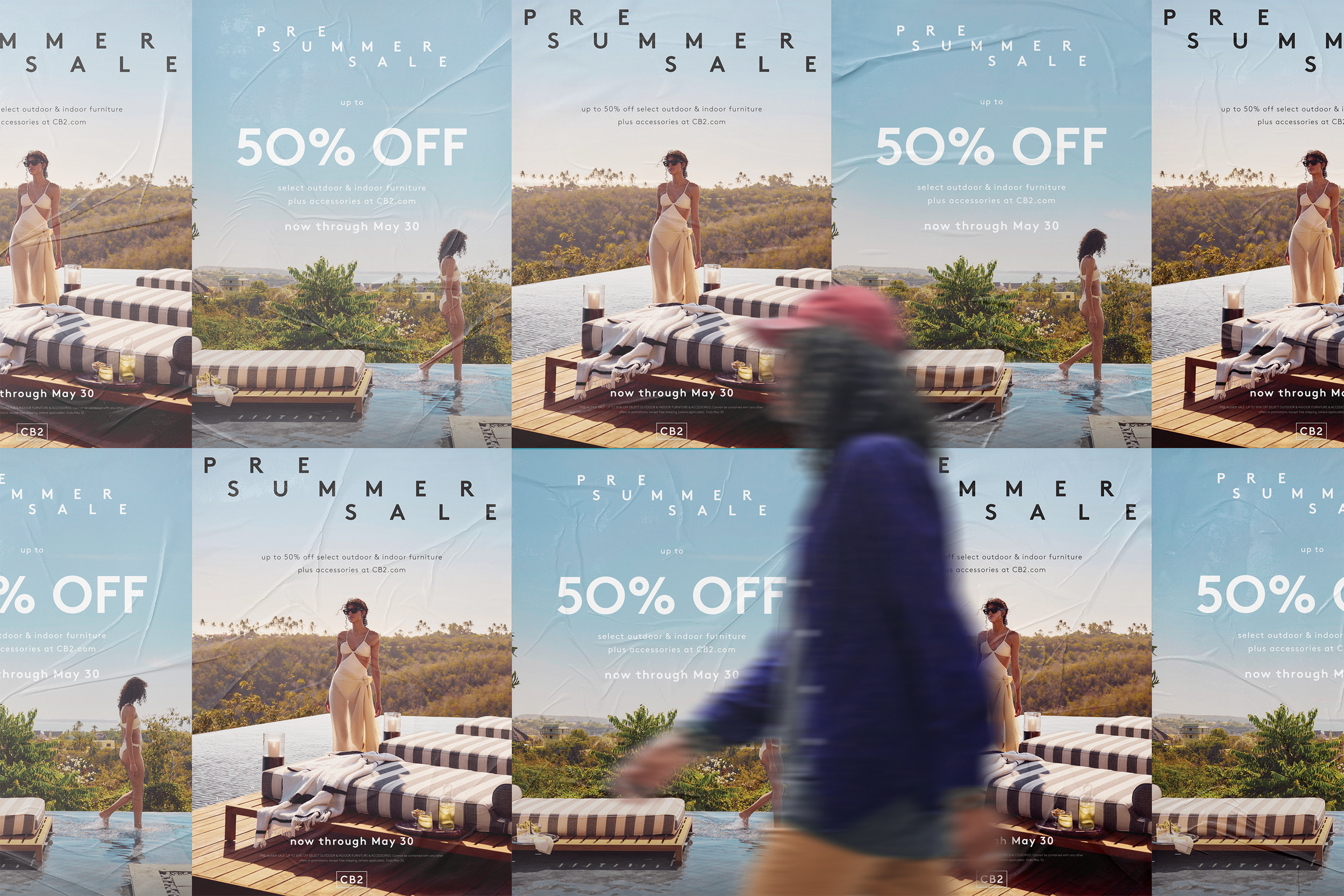
Looking back at past campaigns, I aimed to create a visual system that felt dreamy and less product-focused, while keeping the strategic priorities of the sale top of mind.
CB2 likes to challenge how the brand shows up, both as a whole and across specific marketing channels. This approach allows them to regularly surprise and delight customers while maintaining their trust in the brand as a leader in the home furnishings space.
Embracing this opportunity, I developed a lockup and accompanying visual system made to surprise customers and usher them into the summer season.
Several factors influenced the selection of final images, primarily ensuring that any product featured in the images was included in the sale.
To maintain a cohesive campaign vibe, I chose two photos to lead the campaign. Both images captured the 'dreamy' tone I was looking for and offered the flexibility to be used across different applications. Additionally, they complemented each other well, providing a necessary sense of continuity.
Tests were done with the lockup to ensure that it would work properly across various applications and at various scales. Although “up to 50% off” was the primary message, there would be instances in which “PRE SUMER SALE” would take a front seat to help dive impact and interest.
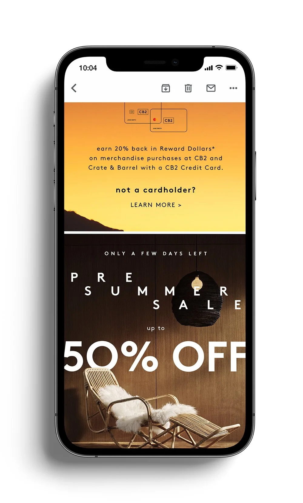
For email and SMS, my copy partner and I worked to apply urgency messaging throughout the promotion to drive traffic.
Whenever possible, I advocated for animated creatives in SMS, strategically enhancing the sale messaging and adding more visual interest.
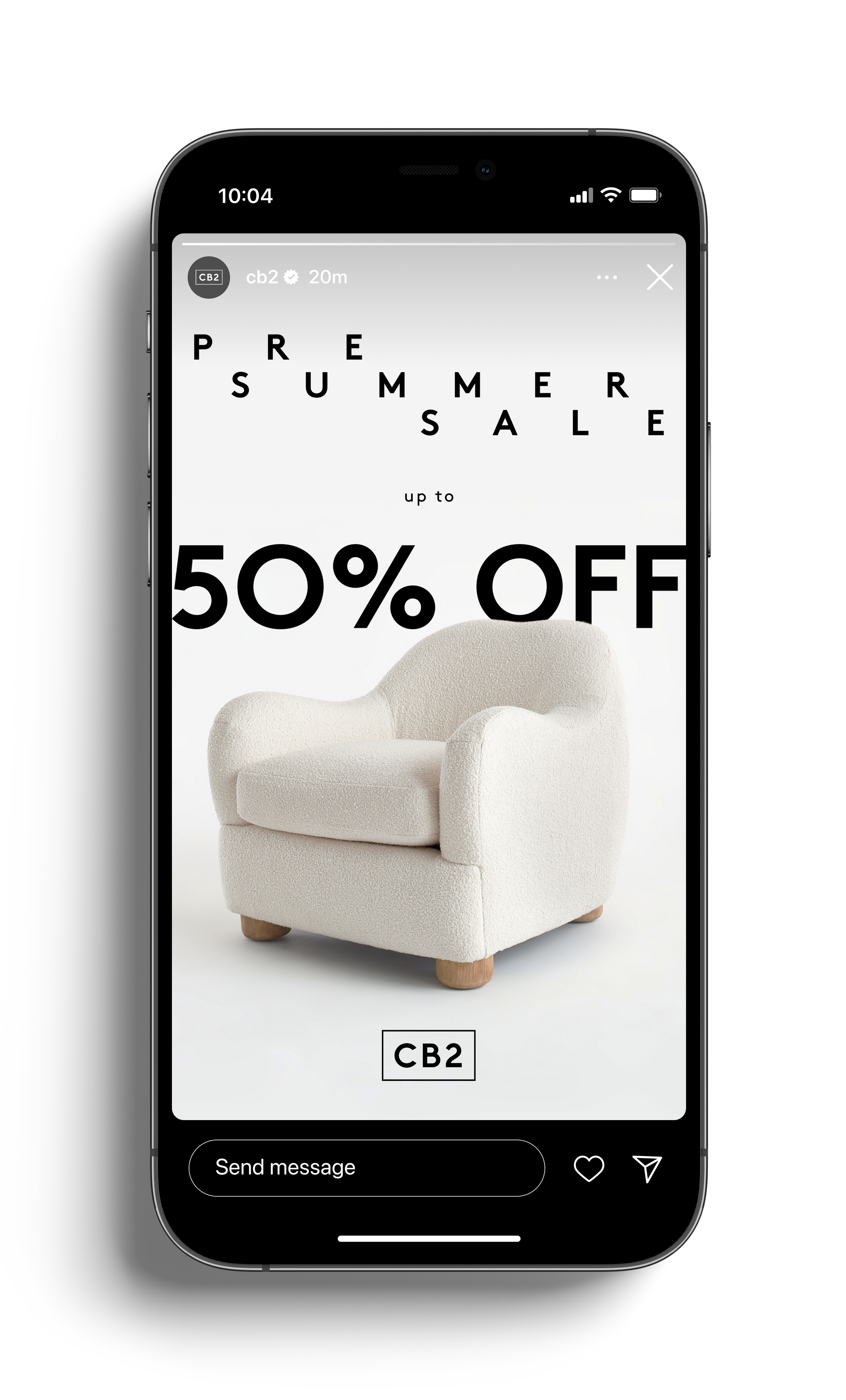
Towards the end of the campaign, the team wanted to make sure that customers weren’t feeling fatigue from the initial beauty images we used. To help with this, we pulled in some of the best-selling SKUs offered within the sale to help maintain interest.
Outcome: The sale performed well—especially across email, which is a big indicator of any campaign’s success. The look & feel also helped pushed the boundaries of what we could do, creatively, in the future.


